
Ask anyone how they know an image was generated, and they will describe a search for flaws: a sixth finger, a window that reflects nothing, a bracelet that melts into a wrist, skin with no pores, light that seems to fall from two directions at once. The search assumes there is a stable thing called the way a real photograph looks, and that any departure from it betrays the machine. There is no such stable thing. What we carry as the look of an accurate photograph is a set of decisions made by engineers, most of them working for two companies, most of them settled before the people now doing the judging were born.
The reflex feels like perception. It is closer to recognition, and what it recognizes is a manufactured standard that has been revised, marketed, and installed in us for the better part of a century. To see why that leaves the reflex unable to do the job we now ask of it, it helps to go back to the point where the standard was first poured into chemistry.
The look was authored
Color film never recorded color. It translated whatever light reached it into the response of three dye layers, each answering to a band of the spectrum, and that translation was authored at every step: which wavelengths each layer responded to, how steeply, and how the three stacked into the final image. Kodachrome resolved those choices into deep contrast, clean blacks, and a lean toward warm reds that flattered skin and made a blue sky snap. National Geographic ran on it for half a century, which meant that for an enormous audience the Kodachrome rendering became the mental image of what a photograph of the world was supposed to be — the saturated foreign street, the amber late-afternoon portrait, a red that read as definitively red.
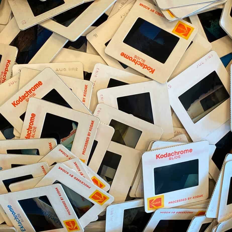
Fuji held a different opinion. Velvia pushed saturation and contrast far enough that landscape photographers adopted it as their benchmark while its detractors called it Disney-chrome and Crayola-chrome. It rendered greens and blues at an intensity no eye reports from a real hillside, turned skin so red it was unusable for portraits, and — a small, telling detail — reproduced purple accurately where Kodachrome had always slid purple toward blue. Two engineering teams, an ocean apart, shipped two incompatible accounts of correct color, and both were received by their users as realistic.
That is the whole argument in miniature. Realism in a photograph was a house style, and the disagreement between Rochester and Tokyo over how a flower should look was a disagreement between opinions, resolved commercially rather than by any measurement of the flower. Black-and-white had struck the same bargain a generation earlier and worn it more openly, since no one mistakes a grey world for the real one, yet the choices of contrast and tonal weight were choices all the same.
The standard had a face
The house style had a face, and it belonged to someone. For decades, the reference image that photo labs used to set skin and exposure was a card showing a white woman, known in the trade as a Shirley and printed with the word normal. The chemistry followed the reference: film latitude and print processing were tuned to render pale skin correctly, and darker skin fell outside the range the system was built to hold. Kodak fielded complaints for years, including from Black families whose children came out as featureless dark shapes in newly desegregated school portraits, and moved slowly; by the late 1970s Jean-Luc Godard would refuse to shoot on Kodak stock in Mozambique on the grounds that the film was racist.
The correction, when it came, was driven by commercial pressure — furniture and chocolate manufacturers who wanted their dark woods and dark browns rendered properly, and later markets Kodak could no longer afford to ignore. The reference frame that a whole industry treated as neutral was one particular idea of whom a photograph was for.
The look outlived its medium
When capture went digital, the engineered look did not dissolve with the emulsion. Photographers who had built careers on Velvia found their raw files flat and lifeless by comparison, and learned to rebuild the film’s saturation and contrast with sliders, chasing a chemical look through software. Stock agencies and magazines held a consistent palette on purpose, because a recognizable house look was part of the product they sold.
Then the camera became a phone, and the house style stopped being a choice. Every frame a modern phone returns has already passed through a pipeline that merges several exposures, lifts the shadows, sharpens the edges, warms the skin, and lifts the sky, all before the image reaches the screen. That processing is tuned toward a bright, high-contrast, saturated result and applied by default to billions of pictures, which is why photographs from different people in different places have begun to look oddly alike, and why a small movement of photographers now hunts for camera apps that will switch the processing off and hand back something that still looks photographed. The reference set moved out of the darkroom and into firmware, and it remained what it had always been: an aesthetic, maintained by engineers.
Why the instinct fails
Return now to the reflex the essay opened on. The tells people trust turn out, on inspection, to be a catalog of aesthetic expectations — the way light ought to fall, the symmetry a face ought to have, the texture skin ought to carry, and a distrust of anything that looks too clean or too composed. Every one of those is an expectation the image industry spent a century installing.
The evidence is sharpening as the models improve. A 2025 study put images from the current generation of text-to-image models in front of people and recorded not only their accuracy, which hovered near chance, but their reasons. Participants reached for the familiar list of flaws — broken geometry, impossible lighting, a detail that fails to add up — and, running short of flaws, for a feeling that an image was too perfect or faintly uncanny. Against the newest model in the set, detection fell below a third. Too perfect is the revealing verdict. A model trained on a mass of images converges on their average, on the most regular and unblemished version of whatever it is asked for, and that regularity is exactly what a century of house styles taught the eye to read as correct. The image meets the engineered ideal without the friction a lens and a scene introduce, and each new model meets it more completely than the one before.
So the instinct is aimed at the wrong target. It measures how closely an image conforms to a manufactured convention, and generative models are built to produce that convention. The better they get, the more they pass, because passing was defined all along as looking the way our devices taught us that pictures look.
The instinct was never a test of what is real. It was a test of what is familiar, and the familiar was assembled — in Rochester and in Tokyo, in the labs that decided how a face should sit in the frame, in the phones that now finish every picture before we see it. A generated image that meets those settings reads as true, and a real photograph that leaves them reads as suspect. The eye that a century of engineering trained to know a good picture has become the least dependable judge of an accurate one, and it is unreliable precisely because it was trained so well. Every generation took its manufactured look for the plain appearance of the world and could not tell it was a look at all. We do the same today with the palette our devices hand us, with one difference: an image no longer needs anything in front of the lens to arrive carrying it.

Author: Paul Melcher
Paul Melcher is a highly influential and visionary leader in visual tech, with 20+ years of experience in licensing, tech innovation, and entrepreneurship. He is the Managing Director of MelcherSystem and has held executive roles at Corbis, Gamma Press, Stipple, and more. Melcher received a Digital Media Licensing Association Award and has been named among the “100 most influential individuals in American photography”
Comments are closed, but trackbacks and pingbacks are open.